


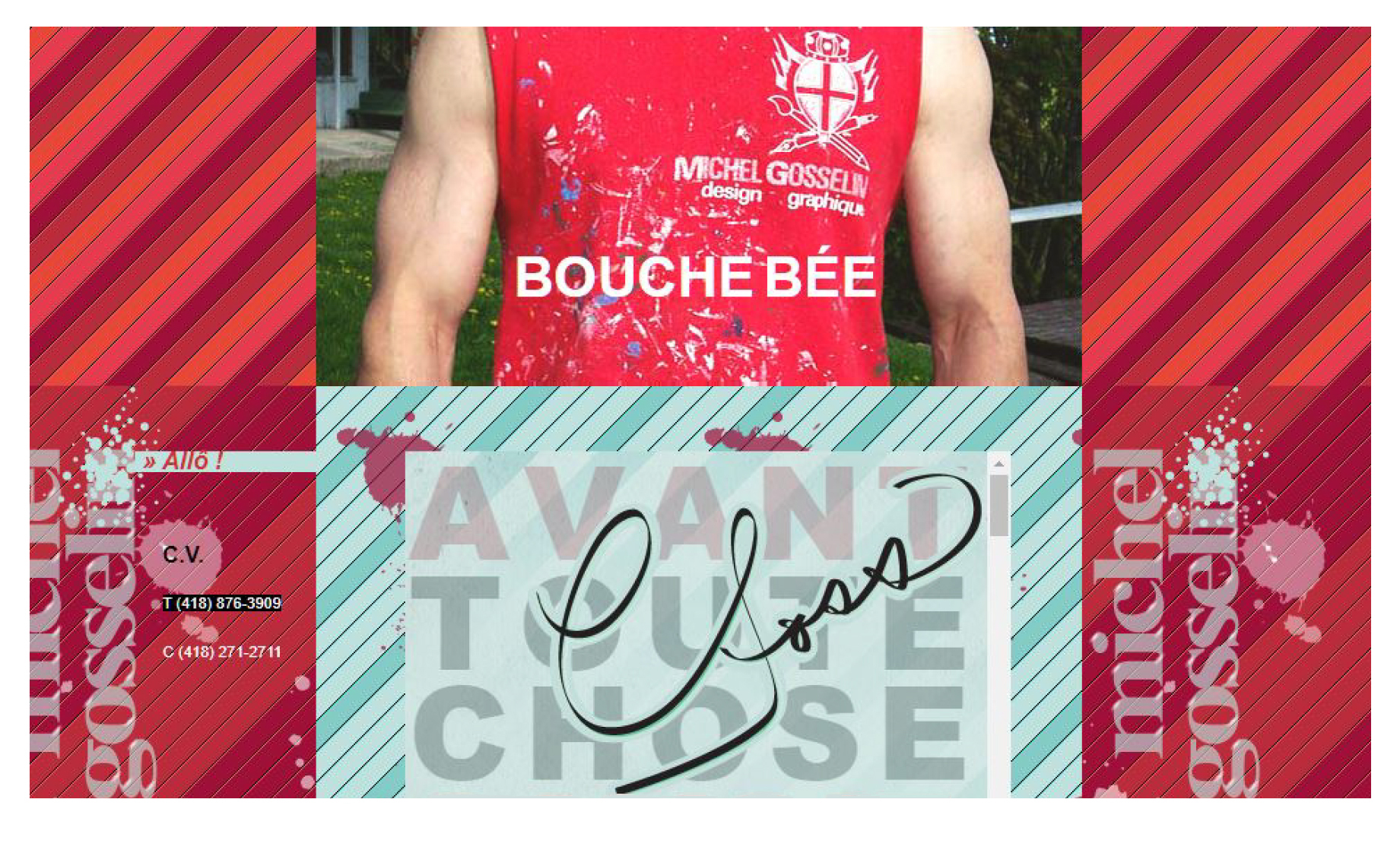
Good-looking Mickey: hooking up by the mouse
 There is language in the art of the visual notification. At this point (no return yet), the red marker map is your guide
line for beginning the road trip of your life! ONYX, in fact, is the RAM Promaster for all caravaning displacements.
There is language in the art of the visual notification. At this point (no return yet), the red marker map is your guide
line for beginning the road trip of your life! ONYX, in fact, is the RAM Promaster for all caravaning displacements.
Looks like good: Identity and DNA
 Impressive manual for the usage of the corporate identification of the municipality.
There is just one colour, the green, if we take in mind that, in offset printing, the black (the blue in fact) is not counted as one... Access to their website: Saint-Augustin-de-Desmaures.
Mining good: Corporate documentation
 At the beginning, the client wanted 2 SS based in a single triangle. This archetype, Les Services
Subaquatiques BLM, was made to remind the stability, and the movement of deep water.
At the beginning, the client wanted 2 SS based in a single triangle. This archetype, Les Services
Subaquatiques BLM, was made to remind the stability, and the movement of deep water.
Looks like good: Telephone banking for freelancers
 Le Réseau META of Quebec and Levis is my
opportunity to make me know from other freelancers.
Le Réseau META of Quebec and Levis is my
opportunity to make me know from other freelancers.
Fine, informal: everything passing away!
Looking for good health: Trademark is inspiring
 The very trendy look is obtained by 2 major letters in the words. Freezing at this point...
Looks like good: Agenda for COMINAR
 The Investment Trust provides the largest commercial property owner and manager in the province
of Quebec. The big agenda is a powerful tool.
The Investment Trust provides the largest commercial property owner and manager in the province
of Quebec. The big agenda is a powerful tool.
There is a Rendez-vous for doing good business. And I personally contribute to the creation of the website (the first and old!).
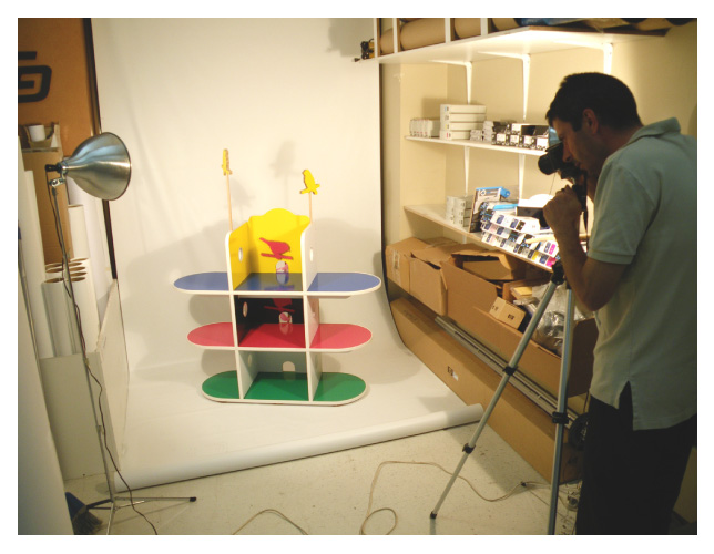
Looks like good: Packaging for Créa-bloc
 In 1998, La revue Protégez-vous discern the price for the best game for kids (among 3 hears
and older). The cover is especially made for recognition of specific pieces.
In 1998, La revue Protégez-vous discern the price for the best game for kids (among 3 hears
and older). The cover is especially made for recognition of specific pieces.
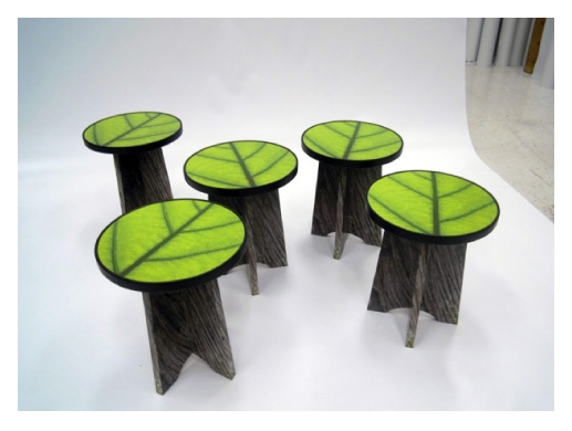
Good is simple: like children playing
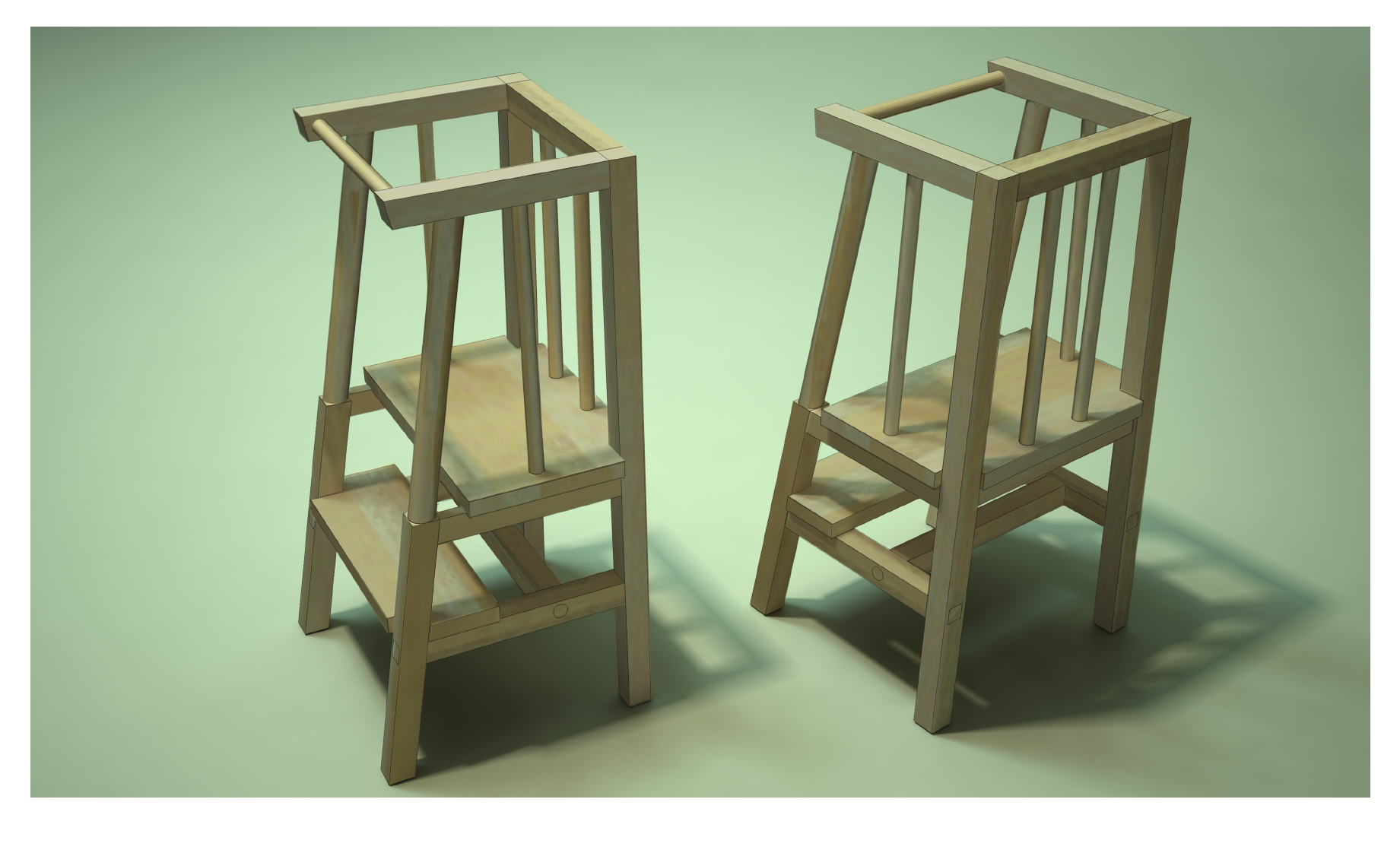 The little lady Abigaelle decided to help her mother in the kitchen. But, first, she climbs a stool of two marches.
Tanks for my skills manual wooden worker and the line tools (Craftsman)!
The little lady Abigaelle decided to help her mother in the kitchen. But, first, she climbs a stool of two marches.
Tanks for my skills manual wooden worker and the line tools (Craftsman)!
Good is simple: The number on the label
 2 labels are affixed to cheese bag regarding the product, specs and address of the cheese shop based in Quebec City.
Good is simple: newspaper
 From all over the Portneuf County, everybody can see the very low price of CD-Rom bundle,
or a computer combo. In fact, that's what we called lost leaders!
From all over the Portneuf County, everybody can see the very low price of CD-Rom bundle,
or a computer combo. In fact, that's what we called lost leaders!
Good is simple: Sous-main
 This is an address and phone agenda you can use daily on your desk. And, monthly, you
refresh all the mind set. A kind of the notorious save as on a computer desktop!
This is an address and phone agenda you can use daily on your desk. And, monthly, you
refresh all the mind set. A kind of the notorious save as on a computer desktop!
Good is simple: Flyer on the road
 Meubles Perron is getting the business rolling on! A particular approach by old mail stuff,
delivery directly at home.
Meubles Perron is getting the business rolling on! A particular approach by old mail stuff,
delivery directly at home.
Good is simple: Attractive paper for Ad
 Very attractive smile for the Microsoft Educational program stuff! Dedicated to OIQ's young engineering profession.
Good is simple: The small footprint of a bird
 This print includes three companies at the same address, at St-Basile. What a good
way for reducing the carbon footprint!
This print includes three companies at the same address, at St-Basile. What a good
way for reducing the carbon footprint!
Good image: a single one for a thousand words
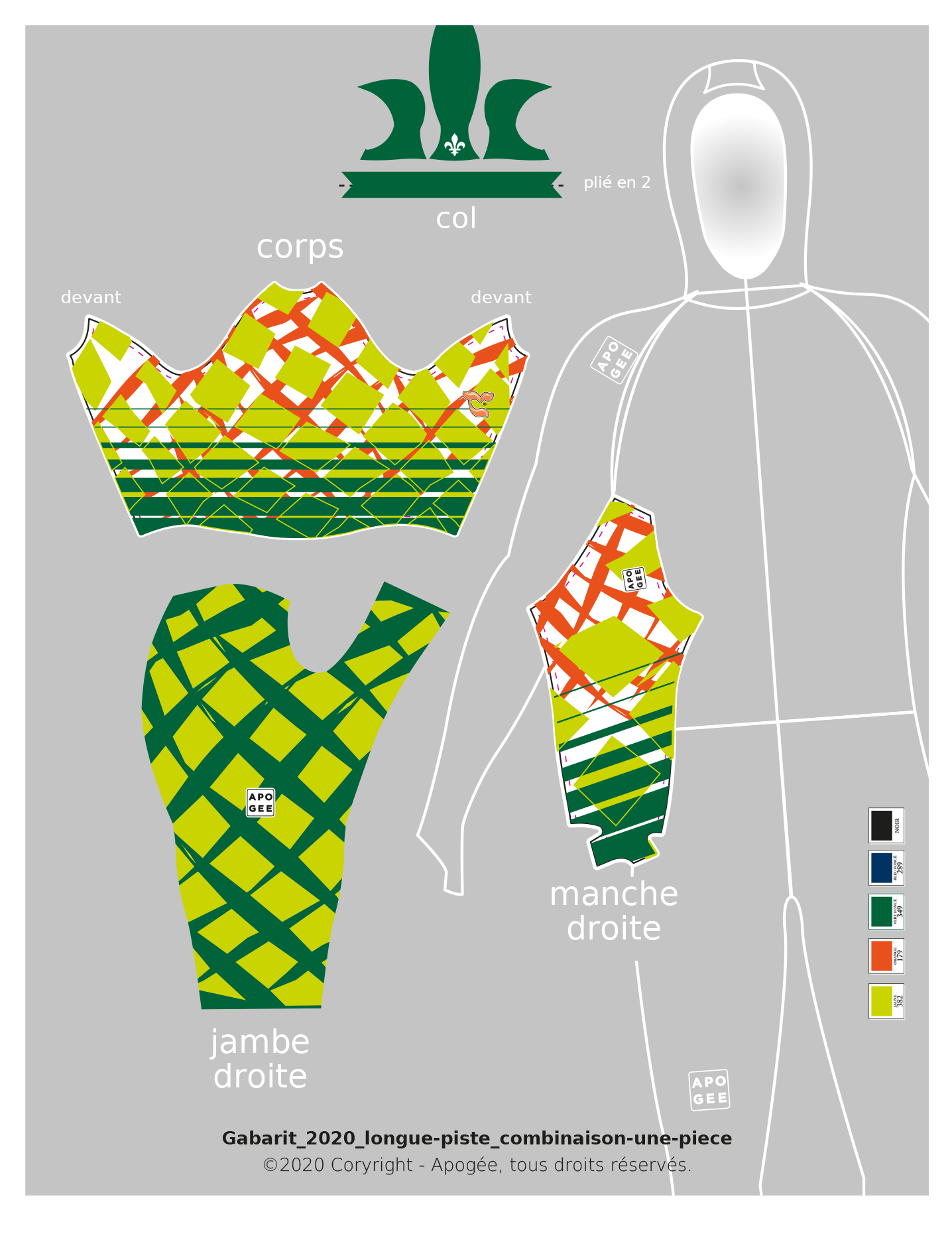 To be swift on your skates. A compliment for anyone who is witty or intelligent. There is the crown for long-track
speed skating one-piece suits. Proudly Quebecers!
To be swift on your skates. A compliment for anyone who is witty or intelligent. There is the crown for long-track
speed skating one-piece suits. Proudly Quebecers!
Good image: a single one for a thousand words
 Bombardier searched for those concepts to promote the Sea-Doo Division. All the vector art, completely done
in Illustrator (Adobe state of the art software), was printed on t-shirt and sweatshirt using different base
colour for background.
Bombardier searched for those concepts to promote the Sea-Doo Division. All the vector art, completely done
in Illustrator (Adobe state of the art software), was printed on t-shirt and sweatshirt using different base
colour for background.
Good image: a single one for a thousand words
 Bombardier searched for those concepts to promote their Sea-Doo Division. All in vintage vectors (...).
Oh yeah! Oyez!
Bombardier searched for those concepts to promote their Sea-Doo Division. All in vintage vectors (...).
Oh yeah! Oyez!
Good image: a single one for a thousand words
 Bombardier! Oh well! Dozen for my thousand vectors victories!
Good image: a single one for a thousand words
 Well done for contracting all this illustrator lucrative concepts in just one year ;-)
Good image: a single one for a thousand words
 This one is the most sold! Especially for the wide-eyed youngsters (XXSmall printed
white base). Solid sales at five dozen commands at a time.
This one is the most sold! Especially for the wide-eyed youngsters (XXSmall printed
white base). Solid sales at five dozen commands at a time.
Good image: a single one for a thousand words
 This project was created entirely by a simple pencil on Strathmore 300 series bristol smooth paper.
Good image: a single one for a thousand words
 A single concept made to be represented on the poster (specific sponsors) and t-shirt, by the hot stamping printing process.
Good image: a single one for a thousand words
 The concept requested a three-colour spot that represented Quad Nature (VTT Club). That seemed to be
very funny and amazing to take a BRP Traxter on the go!
The concept requested a three-colour spot that represented Quad Nature (VTT Club). That seemed to be
very funny and amazing to take a BRP Traxter on the go!
Good image: a single one for a thousand words
 The colour of Laval University was used and embodied the height competitive spirit into the academic sport.
Creating to reach out the bold expose for UL faculties.
The colour of Laval University was used and embodied the height competitive spirit into the academic sport.
Creating to reach out the bold expose for UL faculties.
Good image: a single one for a thousand words
 Teaser business postcards dedicated to High Frequency System distinguished clientele.
Just in time for chrismas season.
Good image: a single one for a thousand words
 The poster shown the site of labour competition as a big map. During printing,
it doesn't appear for sure we had two hot-air balloons (5000$/each)?
The poster shown the site of labour competition as a big map. During printing,
it doesn't appear for sure we had two hot-air balloons (5000$/each)?
Good image: a single one for a thousand words
 This is an example of hot stamping printing. Four models were available for companions of the financing campaign.
Good image: a single one for a thousand words
 For the comprehensive steps of a t-shirt creation concept. After blue-print pen, I make the inking of my drawing. Next thing, computerize
by scanning and separating all colour in each positive film.
For the comprehensive steps of a t-shirt creation concept. After blue-print pen, I make the inking of my drawing. Next thing, computerize
by scanning and separating all colour in each positive film.
Good to see online: first in the line
 The rules have changes! Drawing is easier than ever! I can create virtually anything. From a concept on paper, transfer it
into the computer... Next, be sure your manual practising connect with the real world?
The rules have changes! Drawing is easier than ever! I can create virtually anything. From a concept on paper, transfer it
into the computer... Next, be sure your manual practising connect with the real world?
Good to see online: first in the line
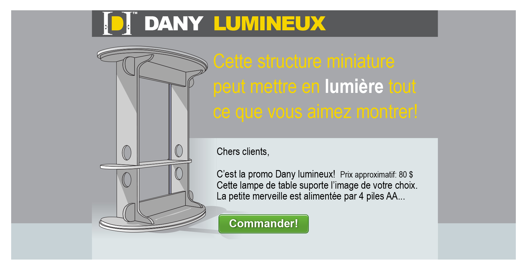 Stay in touch with customers how wants information about great stuff. This bright illuminated frame system makes
luminous your favourite picture! View in new window here.
Stay in touch with customers how wants information about great stuff. This bright illuminated frame system makes
luminous your favourite picture! View in new window here.
Good Jesus! You've got a passion (Golgotha)!
 It's much more than a pretty face on the screen (there's no face at all!). Yes, I'm outstanding at this location since 2010!!
Where I began to writing/coding in CSS.
It's much more than a pretty face on the screen (there's no face at all!). Yes, I'm outstanding at this location since 2010!!
Where I began to writing/coding in CSS.
I've been logged off for a while...
wired and wild!
Good culture on line: at the pinacle
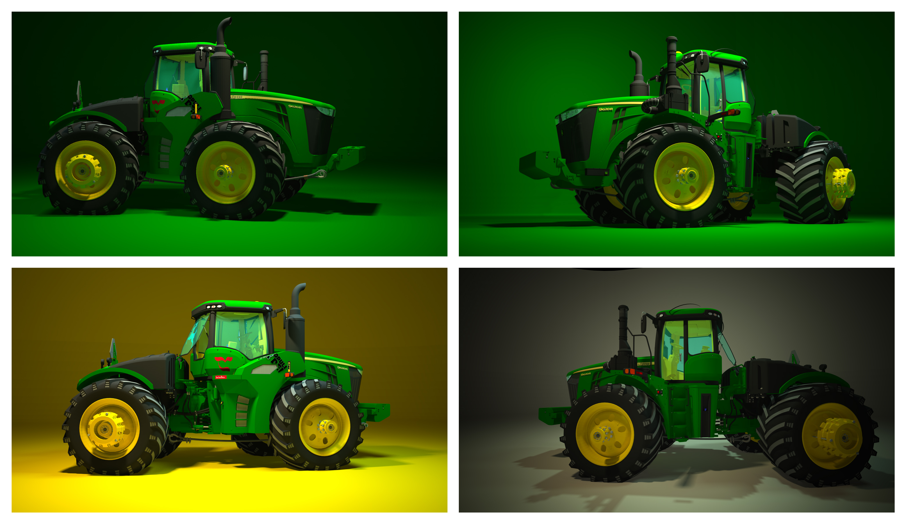 Drawing the new John Deere 9R series was a good challenge for me. There's no picture on the revolutionary
architecture on the Net. What the heck? But I love mechanics and make problems well done.
Drawing the new John Deere 9R series was a good challenge for me. There's no picture on the revolutionary
architecture on the Net. What the heck? But I love mechanics and make problems well done.
Good to see on screen: find the fine line art
 Cars (the film) shows very special characters. Like my tractors at their best! This is why the drawing of the face-to-face
encounter. It reminds me some nice human couples yet?
Cars (the film) shows very special characters. Like my tractors at their best! This is why the drawing of the face-to-face
encounter. It reminds me some nice human couples yet?
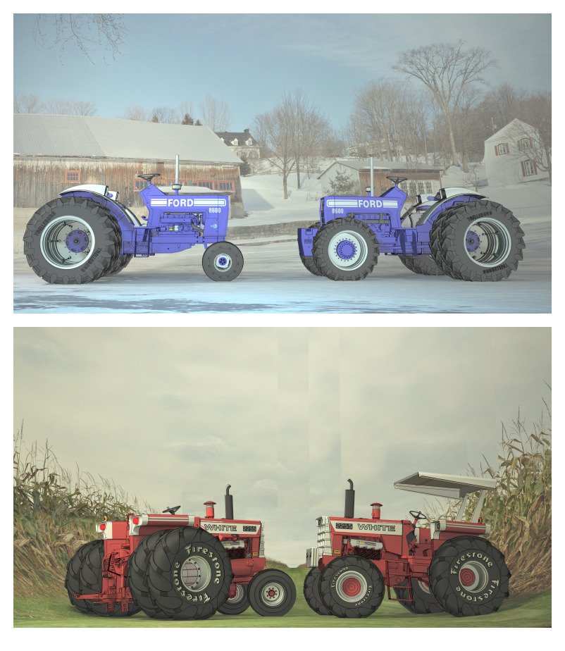
Good is the winner: Ford-8600
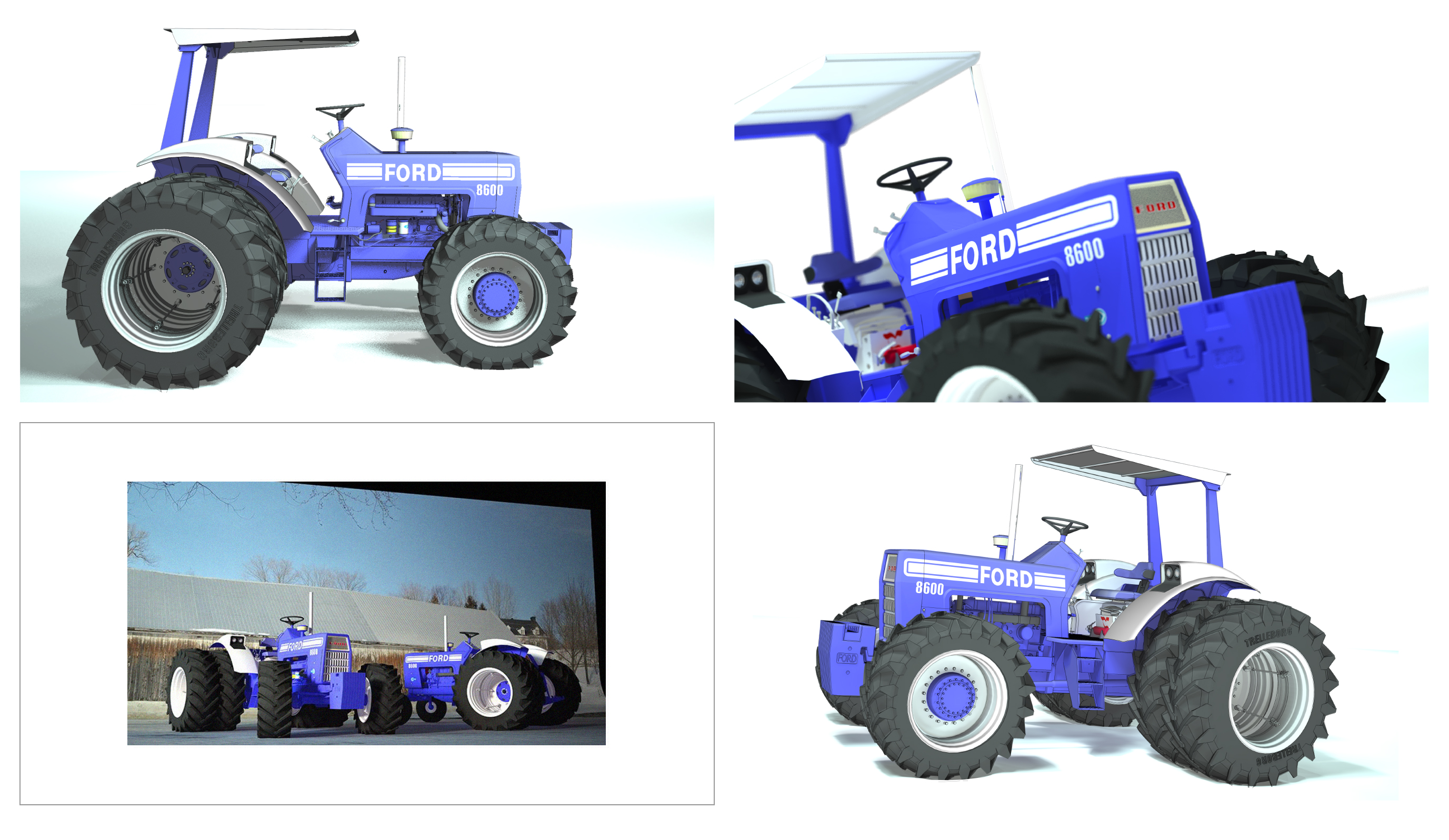 Did you know the Ford colour scheme was red, before to turn to blue? In fact, since the beginning of sixties, there was
the big blue for the new word generation! But, the most important, in the seventies, they were the arrival of the lines
8000 and 9000.
Did you know the Ford colour scheme was red, before to turn to blue? In fact, since the beginning of sixties, there was
the big blue for the new word generation! But, the most important, in the seventies, they were the arrival of the lines
8000 and 9000.
Good winner too: Oliver number 2255
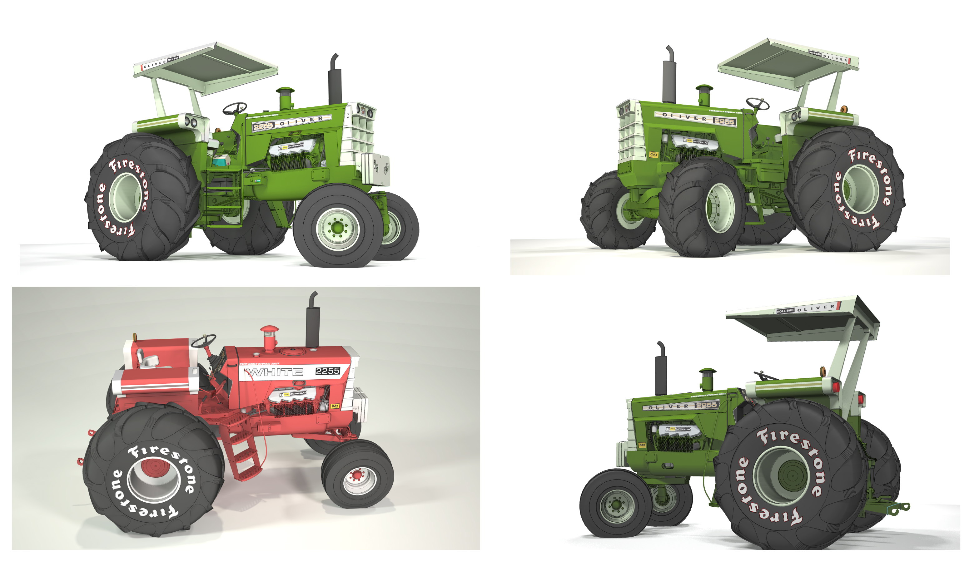 Firstly, for discussing, the colour scheme of the Oliver 2255, was green. But the White acquirer company
decided to badge in red. It was in the beginning of the 1970s. And, then, just a prototype. This apparentness change against
to metallic grey.
Firstly, for discussing, the colour scheme of the Oliver 2255, was green. But the White acquirer company
decided to badge in red. It was in the beginning of the 1970s. And, then, just a prototype. This apparentness change against
to metallic grey.
Good pumpkin-colour: Persan-orange!
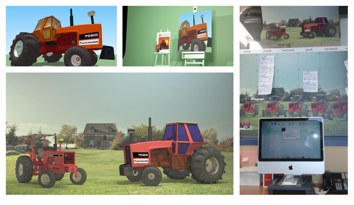 The grandpappy of all the orange tractors Allis-Chalmers was the deep-green and yellow paint scheme. But, not to make
trouble with John Deere, Allises were pumpkin-coloured Persian-orange paint. Responding to new generation of JD,
the 7000 series have his own sleeky design!
The grandpappy of all the orange tractors Allis-Chalmers was the deep-green and yellow paint scheme. But, not to make
trouble with John Deere, Allises were pumpkin-coloured Persian-orange paint. Responding to new generation of JD,
the 7000 series have his own sleeky design!
Good in starting: first in line!
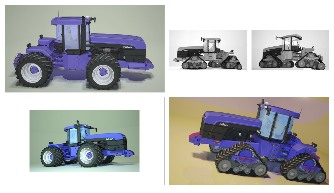 Buhler Industries put hands on Canadian tractor Versatile. Then they were all blue! Naturally. The Ford company
acquirer put the name New-Holland! But, to interact with customers remembrance, the colour scheme return to previous Versatile: red.
Buhler Industries put hands on Canadian tractor Versatile. Then they were all blue! Naturally. The Ford company
acquirer put the name New-Holland! But, to interact with customers remembrance, the colour scheme return to previous Versatile: red.
Good clicks: one click at a time
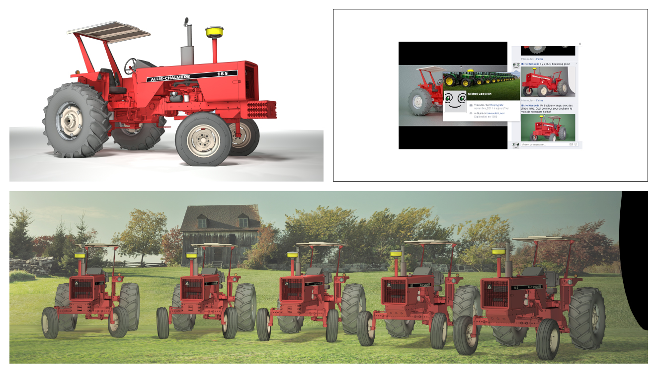 Spending more time altogether! You give me one more reason to garner all this stuff? It's all about the social networks.
In fact, my drawings can be shared in Facebook page and provide a link between me and my readers followers!
Spending more time altogether! You give me one more reason to garner all this stuff? It's all about the social networks.
In fact, my drawings can be shared in Facebook page and provide a link between me and my readers followers!
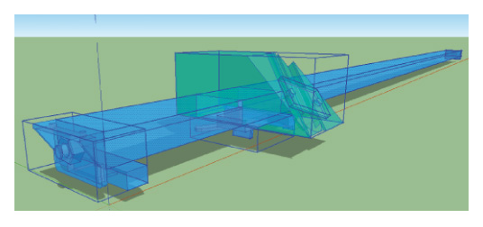
Good move: study steady in 3D
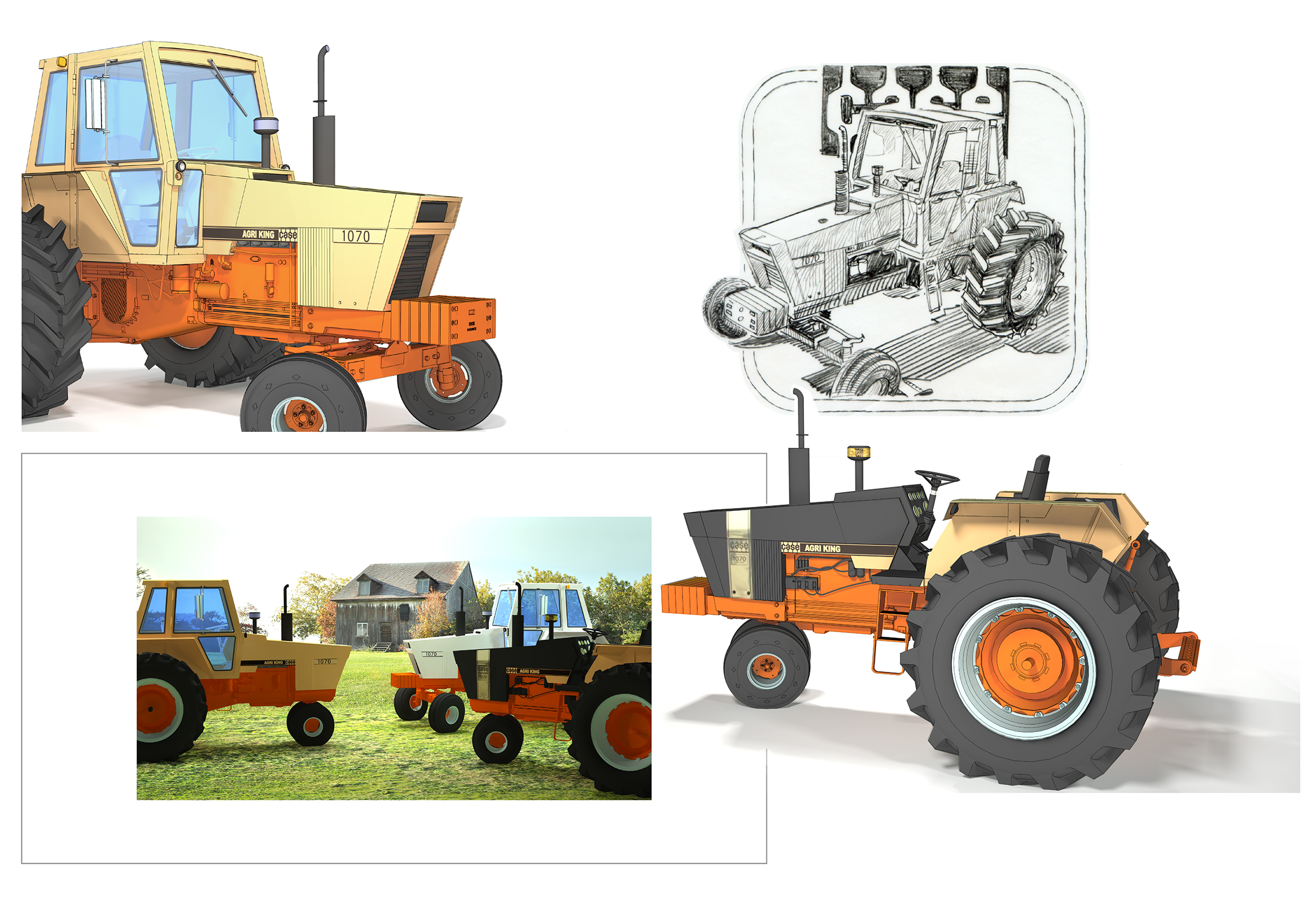 There it is, my very first drawing in 3D, made easy with SketchUp! The case is the computer to compute my software
of predilection. My choice for this tractor turning around simplicity. What a good efficient designing!
There it is, my very first drawing in 3D, made easy with SketchUp! The case is the computer to compute my software
of predilection. My choice for this tractor turning around simplicity. What a good efficient designing!
Good level of grey: perfect iMG
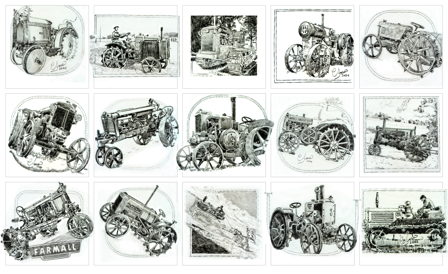 The book 100 tracteurs cultes, by author Fr. Dréer, at Solar ed. 2013, was a huge hit on me. I decided to recreate in my own values of grey!
The rust colour for the section of old metal wheels reminding me the time is passing freely!
The book 100 tracteurs cultes, by author Fr. Dréer, at Solar ed. 2013, was a huge hit on me. I decided to recreate in my own values of grey!
The rust colour for the section of old metal wheels reminding me the time is passing freely!
Good to see our Website: L'Équipe verte
 R.I.P. Artmérik International, from the Canadian practice firm network, QC. Our team build the website of L'Équipe verte. Proudly involved in the nature
footprint. Like this retraining course of course!
R.I.P. Artmérik International, from the Canadian practice firm network, QC. Our team build the website of L'Équipe verte. Proudly involved in the nature
footprint. Like this retraining course of course!
Good to see on Web: CPFN
 This is the first step to integrate my concept for the new site CPFN. There is Ajax and jQuery
coding, in the heading menu. On the mouse out, it retracting by the left side of the webpage.
This is the first step to integrate my concept for the new site CPFN. There is Ajax and jQuery
coding, in the heading menu. On the mouse out, it retracting by the left side of the webpage.
Good to see on Web: R. Ouellet
 Mademoiselle R. is a young practising graphic designer, a friend, who certainly needs some introduction
to the HTM and CSS coding. This is a challenge for us to design her new website and make it easy some
eventual updates.
Mademoiselle R. is a young practising graphic designer, a friend, who certainly needs some introduction
to the HTM and CSS coding. This is a challenge for us to design her new website and make it easy some
eventual updates.
Good to see on Web: La tabagie Saint-Jean
 La tabagie Saint-Jean approached Artmérik International about creating a beautiful and use-friendly website
that would work as an effective promoting multiple articles on sale (not online store by error)?
La tabagie Saint-Jean approached Artmérik International about creating a beautiful and use-friendly website
that would work as an effective promoting multiple articles on sale (not online store by error)?
Updated weekly by a CMS like Joomla!
Good to see on Web: Webmaster for SCJC
 There are so many things to say! I was the webmaster for this portal. Server based at Sainte-Catherine-de-la-Jacques-Cartier.
Not so far from what we call WEB 2.0!
Stay in touch from time to time folks ;-)
Design is everywhere: Expressly at Neuville
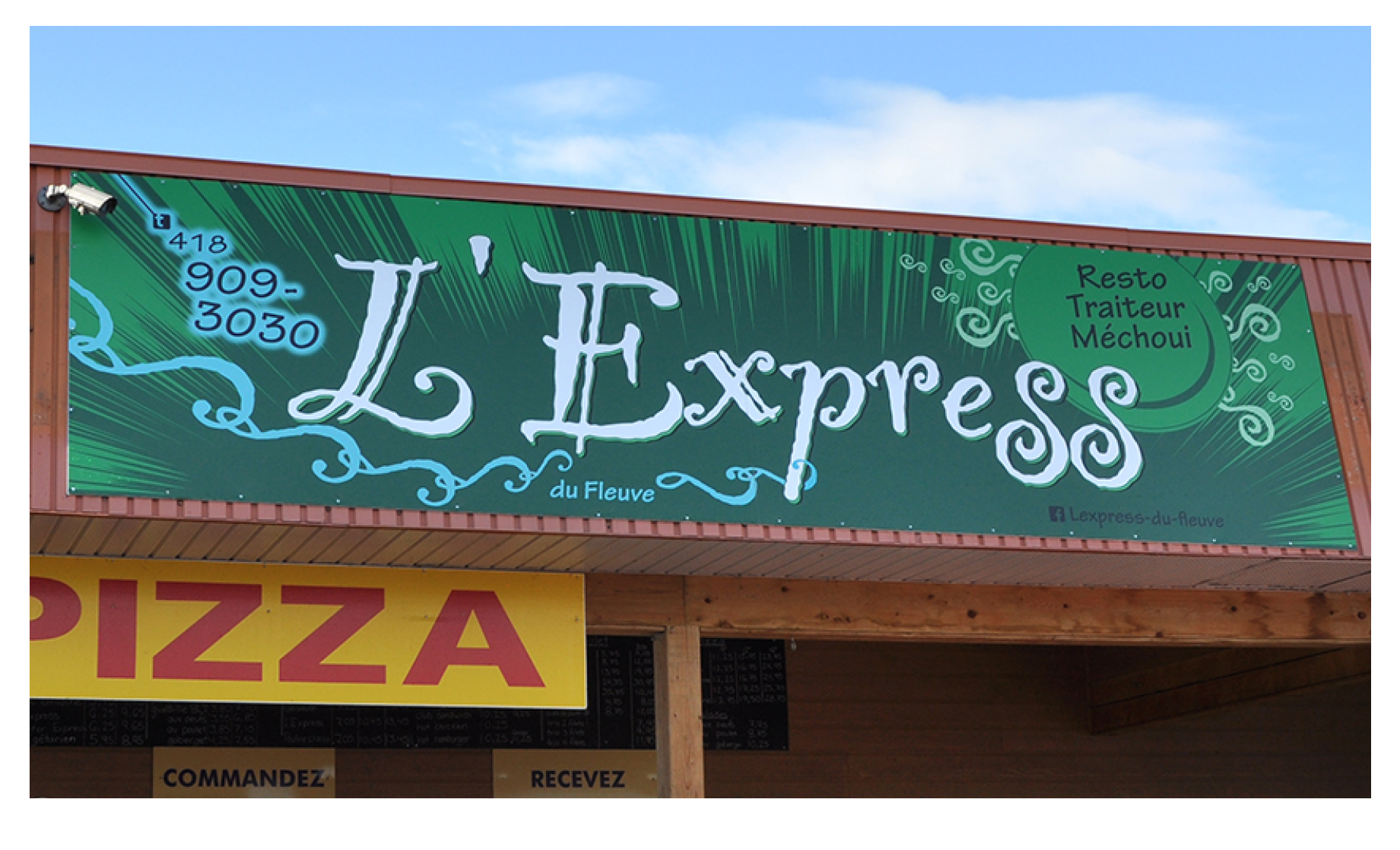 There is a code which you can recognize one address. It began with the letter F, for Facebook. It figures on
the commercial sign attached to the lunch counter. The marina is in the other site (side) of the road!
There is a code which you can recognize one address. It began with the letter F, for Facebook. It figures on
the commercial sign attached to the lunch counter. The marina is in the other site (side) of the road!
Design is everywhere: On the boundaries
 At the boundary of my village, not very far from Quebec, you'll see the simple signs which often
gives an insight into the local history. Evocation, a company from Montreal, did the concept. My
part is to make it stand the road.
At the boundary of my village, not very far from Quebec, you'll see the simple signs which often
gives an insight into the local history. Evocation, a company from Montreal, did the concept. My
part is to make it stand the road.
Design is everywhere: In tip of pencil
 The sculpture is the evocation of a big pencil drawing and his sharpener with a light in the far end,
completely at the bottom!
The sculpture is the evocation of a big pencil drawing and his sharpener with a light in the far end,
completely at the bottom!
...everywhere: Booty in the heart of the wooden chest
 A few years ago, my girl friend wanted a nice solution for a larger accommodation, at the house entrance.
The beggar's bench from Canada is my response: Welcome!
A few years ago, my girl friend wanted a nice solution for a larger accommodation, at the house entrance.
The beggar's bench from Canada is my response: Welcome!
Design is: Writing the next page
 In fact, in the artistic way, a book can be a bench. From le Salon des finissants of 1989, in the hall
exhibition of my Fact, this piece had received a stirring tribute.
In fact, in the artistic way, a book can be a bench. From le Salon des finissants of 1989, in the hall
exhibition of my Fact, this piece had received a stirring tribute.
Design is everywhere: In the altitude
 I take a great pleasure to realize this kind of object. At the beginning, people asking me:
—What is it? Hundreds of different kinds of books, if you read between the lines!
I take a great pleasure to realize this kind of object. At the beginning, people asking me:
—What is it? Hundreds of different kinds of books, if you read between the lines!
Design is everywhere: In backing good food
 Sometimes, my girl friend asking me nice solutions for a larger home storage? This time, I revolving in 3D for resolving
the very recurrent question.
Sometimes, my girl friend asking me nice solutions for a larger home storage? This time, I revolving in 3D for resolving
the very recurrent question.
Design is everywhere: Front of the Maxy's & Cie.
 Although different types of signs were designed. But Michel (Cadrin for the money makers Quebecker) took this oval one for his newest
visual identity. Nice try Mike.
Although different types of signs were designed. But Michel (Cadrin for the money makers Quebecker) took this oval one for his newest
visual identity. Nice try Mike.
Design is everywhere: Savant words
 Somme banners was installed straight on the spot of the cheese dairy factory. Nice agreement for those visitors at Flagrant déli
restaurants. OK, good subventions.
Somme banners was installed straight on the spot of the cheese dairy factory. Nice agreement for those visitors at Flagrant déli
restaurants. OK, good subventions.
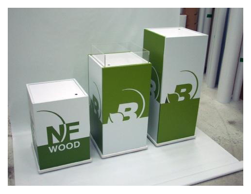
Re-board time: UMO-OnePiece
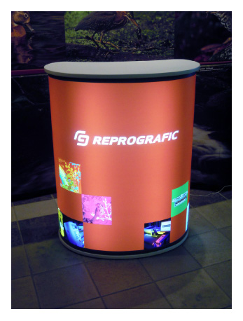 Reprografic is dead, long live to Repro! We customized this counter that illuminated all your needs. My design is thinking twice for
assembling the singleness message from just one piece of Re-board.
Reprografic is dead, long live to Repro! We customized this counter that illuminated all your needs. My design is thinking twice for
assembling the singleness message from just one piece of Re-board.
Re-board time: UMO-Bio
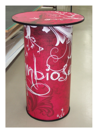 The perfect counter in show! All around, stand-up and make a good deal! With computers and glass in half hand!
Re-board time: Berger's gigognes podium
 Tribute for Berger who mastering the craft of growing media! Did you think that all this holds in a suitcase? Yes Sir!
Re-board time: Gift shop project
 This is the exceptional self-display for over 1500 gifts! All packaging at your hand by a comprehensive organization compartments.
Closing the deal on the red gift box and proceed to checkout.
This is the exceptional self-display for over 1500 gifts! All packaging at your hand by a comprehensive organization compartments.
Closing the deal on the red gift box and proceed to checkout.
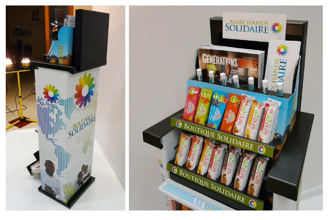
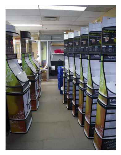
Re-board time: Army of readership
 The floor and counter display for thousands magazines. A simple way to joint an army of readership, mostly French ones.
Re-board time: Promo. Repro.
 We are sure you'll love this little attention! Sit down and take your time to the seminar show. It's working similar as
woodworking techniques assembly.
We are sure you'll love this little attention! Sit down and take your time to the seminar show. It's working similar as
woodworking techniques assembly.
Re-board time: Modular shelf assembly
 Very simple and so much inspiring! You can also have your own logotype and a world of typography right on top of the unit!
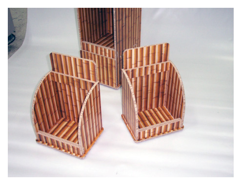
Re-board time: Condominium for big cats
 The furniture for cats. They love playing with it! There is André, the Repro. official
photograph; a passionate of nature, wildlife and landscape! See him on
Flickr ...
The furniture for cats. They love playing with it! There is André, the Repro. official
photograph; a passionate of nature, wildlife and landscape! See him on
Flickr ...
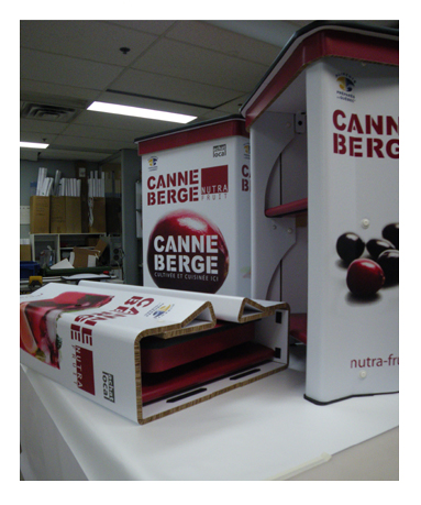
Re-board time: Extractor's Fruit d'Or
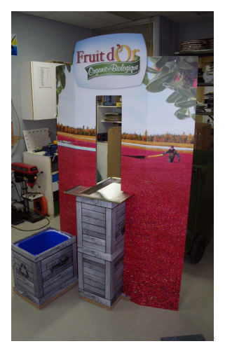 The machine (not shown here) can extract the juice from the cranberry. Basically, the tuff Re-board can support heavy weight like this.
Just on a simple fancy stainless plate!
The machine (not shown here) can extract the juice from the cranberry. Basically, the tuff Re-board can support heavy weight like this.
Just on a simple fancy stainless plate!
Re-board time: The Cutting-Edge cutting tool
 The tool is especially designed for a perfect 45 degrees cut angle. The goal is to remove a V without passing
through the Re-board! What a perfect square in all elevations!
The tool is especially designed for a perfect 45 degrees cut angle. The goal is to remove a V without passing
through the Re-board! What a perfect square in all elevations!
Just see previous extractor of juice ;-)
Re-board time: Raise a toast to Marc!
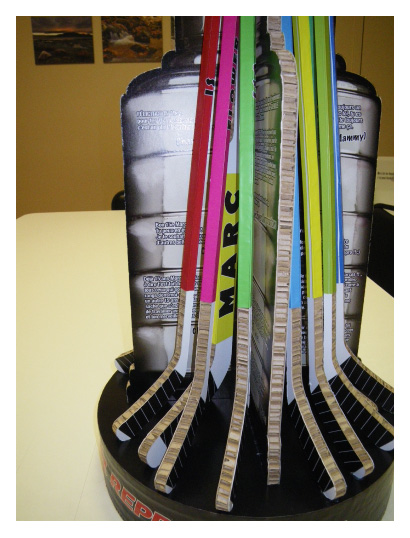 Fifteen years about performing at work at Reprografic is like winning the Stanley cup!
Each stick of ice hockey include a name of some co-worker. The older one is the goalie's Marc!
Fifteen years about performing at work at Reprografic is like winning the Stanley cup!
Each stick of ice hockey include a name of some co-worker. The older one is the goalie's Marc!
This Bud's for you, body!
Re-board time: The new U counter is in the bag
 The portable counter is well designated for easy travelling setup & take down. The transportation bag is a part of a deal!


